
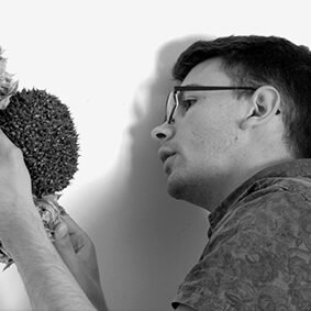
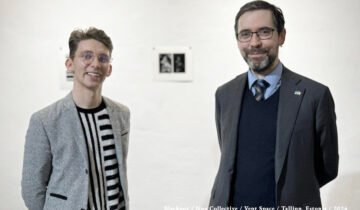
Colour Conversation with Mary O’Connor, Ciaran Bowen and Catherine Ryan. Transcript of Zoom chat held on: 8th December 2020
Catherine:
So if someone were to ask you how important is colour to your artistic practice, how would you describe that?
Mary:
I would say that colour is the most central point of my practice.
Catherine:
and would that come a lot from your experiences of living in different hemispheres – the experience of seeing bright colours – literally from the other side of the world. As in, you brought that into your artwork?
Mary:
Yes I’d say that coming back to Ireland has actually made me question why I like colour so much and why I work with colour so much and – I just think it’s a part of me. And I think that – yes – it’s definitely influenced by the travel, however I think that it’s me anyway. So probably the fact that I’ve travelled to so many places that are very comfortable with the use of colour, it’s made me comfortable with the use of it. And then when I came back to Ireland in 2014, people began to comment on my use of colour. And, I never really got that when I lived in other countries. So I began to think about it and then I began to really notice how a lot of Irish artists use quite a muted palette, and one gallery owner – in fact the Printmakers Gallery which is now sadly shut – he said to me – in Ireland the air is saturated with moisture…
Catherine:
Yes..
Mary:
So, we don’t see colour like you do when you go to a hot country like Spain or Greece.
Catherine:
Yes I’ve heard other artists comment on the landscape and the kind of darker colours used. That’s a really scientific explanation though – the moisture in the air – I’ve never heard that before, that makes sense!
And Ciaran, because your work is really vibrant, I love your use of neon colours and then you also have the black as well, so you have that lovely contrast. If you were to pinpoint a source or an influence – where does that colour come from in your own work?

Ciaran:
Just looking around about it, it’s definitely from my own household and probably because my Dad was a painter and decorator so I’d go and watch him paint. And Irish people would only paint with whites and magnolias and I wanted to put different colours in there, you know! Even as a kid I’d love to throw in a bit of red or blue or something like that. So it was always that painting background, painting and decorating. And also my aunt being a dressmaker – so being around fashion and those kind of fashion books and looking at colour combinations and block colours and things like that.
Catherine:
So like Mary was saying it was something you grew up with, that you were exposed to –
Ciaran:
Exposed to it growing up all the time, yes.
Catherine:
Yes, you’re comfortable with it. And as regards myself, I started to think about it, where did this love of colour come from and you can go right back to childhood. My own Dad did a lot of travelling and he sent back all these postcards – way before the internet or anything so that was my first kind of exposure to the big beautiful colourful world out there! As well you know the souvenir dolls you see in the airport and they’ll have the traditional costume, like each country has their own folk dress –
Ciaran:
Yes –
Catherine:
So that really stuck in my head as well. Just that whole idea that every different place has a different feel to it and a different aesthetic. And again with travelling, maybe it’s a cliché but it’s true – when you go away, when you go out of Ireland and then when you come back, like when I came back to Dublin and I thought oh wow it’s a really pretty city. And shortly after that I made Dublinski. So I’d say definitely travel and our respective backgrounds resulted in a love of bright colours.

And in terms of how you use it – did you study any colour theory in your formal education or is it kind of mixed in with your family background and being at ease with it?
Ciaran:
I think I’ve always had a good idea of colour, I could mix paint well even at a young age. Like I could mix colour blocks but in college is where I learned more about what goes with what. Even sometimes how to brighten up or darken a colour and try and make them fight against each other almost. That’s what I’m enjoying lately – the colours fighting against each other or layered on top of each other and coming through.
Catherine:
Yes actually I’d love to see a video of your process of the peel – like you were saying it’s breaking through, like a skin almost.
Ciaran:
It’s like exposing the history of painting almost, that’s what I’ve been looking at more is uncovering layers of painting.
Catherine:
Brilliant yes. And Mary your use of colour – is it a conscious or subconscious decision or a bit of both?
Mary:
It’s definitely very subconscious. But lately I’ve been consciously selecting different colour palettes and they’re definitely colour palettes that I really go towards.
Those would be a cooler one combined with a hot colour palette. I don’t really go for earthy coloured palettes at all but I’m really pushing myself to experiment with lots of different colour combinations at the moment.
Especially in all these little panels I’m doing lately, so I’m having lots of little finds, that I’m finding very interesting. I tend to randomly throw an awful lot of colour together and make that work. So I’m really trying to make myself hold back and use less colour.
Catherine:
So a more limited palette like two or –
Mary:
Well two is a bit minimal for me!
Catherine:
Oh right yes! (laughing all)
Mary:
Well I’m looking at one there and it’s got four colours in it and it needs another colour and, so, it’s a battle! But there’s some colours and I just love together. I just love how they go together and I go through little phases of being obsessed with that.
Catherine:
Yes that’s a good thing to be obsessed! Because I noticed in your work, like the title of your solo exhibition – Keel – it’s a balance but it’s a tension as well, between the colours. You find a balance between them.
The way I use colours myself I think is that each colour has FOMO – Fear Of Missing Out – so it’s hard to limit my palette. What’s surprising actually, I learned a lot about colour in college but also when I worked as a florist, in terms of what Nature can get away with. It’s amazing! You don’t really know that they go together until you literally experiment and then you find that it works.
Mary:
Yes it’s amazing.
Catherine:
And in terms of colour influencing not just the way your work looks but also the title – like I have a few pieces where I did limit myself to one or two colours like in Pink City or Blue City. Would you ever do that as an experiment – to scale it down a bit – just to push the limits of one colour?
Ciaran:
I think it was last year I was doing some gold paintings just in gold and black. And I was thinking of the richness of colour so I think I named one Golddigger or something like that. So trying to play on the words with the colour as well. So those gold paintings were successful for me anyway, I did enjoy doing a two colour combination at the time.
Catherine:
Great! Like Patrick Scott – he was a great one for gold.
Ciaran:
Gold leaf yes.
Catherine:
So do you go through phases or are there certain colours that you’d always use like orange or blues or?
Ciaran:
For me I think it’s pink.
Catherine:
Pink, yes, me too.
Ciaran:
Pink and black, definitely. I don’t know why it keeps cropping up all the time. I think I like the fluorescent pink. It’s also that general thing of oh boys shouldn’t like pink, but I like pink so I just use a lot of it then.
Catherine:
And if you’re going to use pink you might as well amp it up and –
Ciaran:
Go all out, try and get the brightest pink I can get (laugh).
Catherine:
Yes! A painter friend of mine he told me years ago that he doesn’t like it when I use black. I think that comes from my background in glass design as well you know how the colours in stained glass are literally separated with black lines. And then some people say black isn’t a colour – but I think it is!
Ciaran:
I was kind of the same recently I would never use black. I’d always mix ultramarine blue with burnt umber. To try and get it as dark as possible but there’s almost like a tinge of blue off it. But I’m starting to use black now.
For some reason one day I just changed my opinion of it. But I like how sometimes it kind of swallows the colours, especially when I’m painting on a flat surface. Compared to using the silicone – I’d never really use a black colour for that.
Catherine:
And whatever you use black with, it makes the other colour pop! Because it’s kind of flat, whatever is beside it jumps out. Pink and green as well are great colour combinations.
Mary:
Oh I love pink and green.
Catherine:
Yes! Whatever it is about them, they make each other pop.
And any thoughts about what Mary was saying earlier in terms of Ireland’s visual arts scene, you know the way a lot of painters’ palettes can have quite earthy tones like browns and greys? Would you agree about the influence of the climate in terms of what we’re exposed to?
Ciaran:
Probably, yes. But I’d say a lot of artists would look now towards mass production and what’s on TV and things like that. They go for those type of references, and online references as well so taking them away from that.
But some artists do use a lot of ground colours as well. So it depends on the artist really.
Catherine:
Yes indeed. And something I noticed since the 2000s – the rise of street art. Because really there was no street art scene in Ireland. I think that’s done wonders for visual arts, fine art, all levels of it. So apart from people being more exposed to visual culture through their screens, just to see colour on walls is really great, really uplifting. To make people more comfortable with it (colour) I suppose.
Ciaran:
Oh yes some people if they don’t have an art background would be quite nervous going into an a gallery, like how it works. So yes, street art is more accessible for people even if they weren’t looking for it you would see people stop and take photographs and sometimes even pose with it, you know?
Catherine:
Exactly, so that kind of bridges a gap or –
Ciaran:
Yes definitely.
Catherine:
And that reminds me of another perspective, it was a Russian friend that pointed this out to me years ago, he said – it was a compliment – oh it’s so funny in Ireland you have cottages all in different colours by the seaside. You know in coastal villages and towns you see the multicoloured row of cottages.
Mary:
Oh yes.
Catherine:
So I’d never been fully conscious of it until they pointed it out. Ever since, I suddenly see it. You know you’d see the one pink cottage or –
Ciaran:
And the different coloured doors..
Mary:
Yes. Also I noticed retrospectively that I work very subconsciously with my colours. So when I was living in Kazakhstan – half of the year was a whiteout with snow for the winter and then the snow would melt and then the rest of the year the meadows up in the mountains were absolutely alive with colour; wild flowers, everything. And I’d always paint at that time of the year in colour. And suddenly then in November the snow would come and everywhere would be blanked out in white. And about a week later I’d be looking at it and I’d realise – oh I’m painting in white. So I painted white but kept the little specs of colour through. It was a whole series of paintings. And then when I came back to Ireland – so I live in Sandycove by the sea – and the first two years of paintings when I came back to Ireland were actually all blue.
Catherine:
Oh wow!
Mary:
Yes, all blue.
Catherine:
Yes so maybe you didn’t notice until afterwards, you know –
Mary:
It’s only now that I’m mixing my screen printing with my painting that I’m more consciously thinking of colour all the time because, when you’re screen printing you get these amazing colour combinations and then I go away and I think about those.
And even when you asked me to come and do this talk today with Ciaran, and I love Ciaran’s work so much and your work since I’ve been looking at it. And I realised – Ciaran’s colours are fab but he does manage to use mainly two or three colours each time. And I’m going to look at that more in his work. And then your work I think is maybe more like mine, you use a lot more colours together. So I think you bringing the three of us together is really a nice point of interest to move forward with more thinking, and I’m very happy about it.
Catherine:
Oh great! Thanks a million! About using lots of colours – it’s like a tension, because it can easily go wrong –
Mary: Ciaran: (sounds of agreement).
Mary:
I’ve just taken Ciaran’s Instagram page up here because now I’m going to really look and think how he uses – in the little structures there’s a mass of colour. But then he has two dominant colours.
Catherine:
I love the stripes.

Mary:
So I think Ciaran, you are probably more comfortable with doing a limited palette than Catherine and me. What’s your trick? (laughing all)
Ciaran:
I have them limited but when you look closer – the paint skins that I cut out – they’re kind of a collection of all colours. But the dominant colours I might use one or two. Recently I’ve been trying to show a number of colours. But through like cracks that are coming through almost. So I use two complimentary colours and then I’ll try a colour that shouldn’t really work with it. And I don’t know how they’re working with it. I’m still up in the air with them, the new work.
Mary:
And how do you decide on the day, which two colours?
Ciaran:
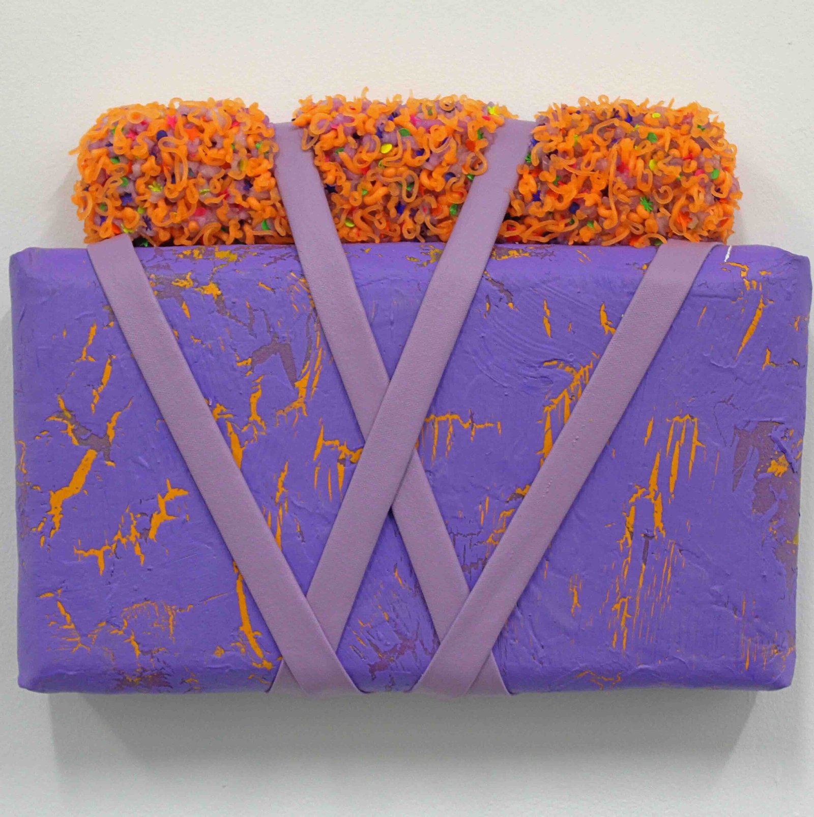
Sometimes I’ll mix a pot of paint and I’m like, I like that. And then – oh I don’t like that. Even the shape lately is kind of like a language to me almost. Maybe a rectangle I often go with purple and oranges for some reason. So in my head I’m associating colour with shapes as well.
Mary:
Ok that’s interesting.
Ciaran:
Yes.
Catherine:
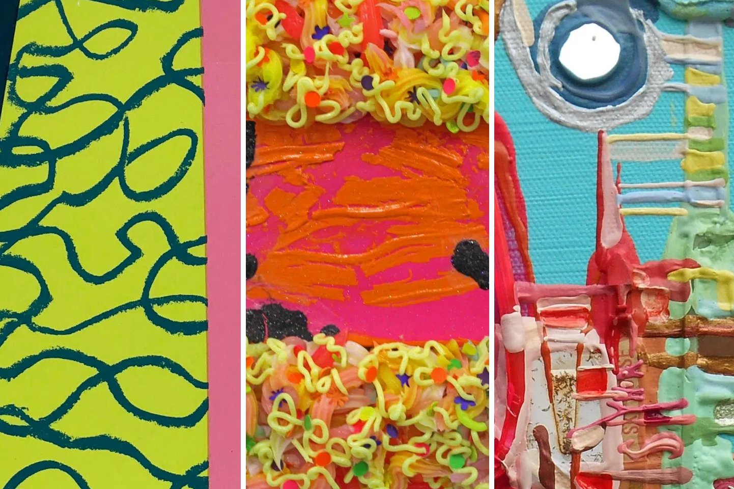
I’m on your page now as well Ciaran and your work it’s almost edible because it’s so tactile. I see what you mean the squiggly bits are multicoloured but then from afar you have the block colours.
Ciaran:
They’re almost merging together. Like blurring one colour together even though they’re two colours in the silicone at times.
Mary:
Yes.
Catherine:
I absolutely love the straps – to me I just think of like – you could just put it in your bag and go on your travels!
Ciaran:
I think that’s from that fashion-y background, where I used to see my aunt make things.
Mary:
Ah ok, yes.
Ciaran:
I wanted to use canvas but I wanted to do it my own way. I kind of just started rolling them and attaching it to objects and painting on them and spray painting them. And they almost look – people ask me is that leather – and I say no that’s only canvas and spray paint. And often acrylic paint.
Catherine:
Because you do manage to make it look like a strap. And if you’re an artist you’re always fascinated, you know, with “how did they make that” and –
Ciaran:
It was weird trying to get the symmetry on the straps. It looks like they’re perfectly placed but it probably took me about an hour or two to try and get them exact and make them look even. It’s very hard to try and get them at times. I’ve had maybe two or three straps at a time. One of the most recent pieces a purple piece, I call it my purple painting with grey card on top. It’s all orange with squiggly bits on top. I think those two straps took me a while, it was that bad I had to walk away from it and come back the next day. I couldn’t fix it until I came back the next day.
Mary:
Ok.
Catherine:
Well that’s it sometimes you do have to walk away you know because it’s so intense!
Mary:
Yes.
Catherine:
If you’re right up against something, you absolutely do need to take a break and then see it with fresh eyes.
Mary:
Now I’ve opened up your page Catherine. So you actually use a lot of earth tones, to ground your wild colours.
Catherine:
Oh yes.
Mary:
That’s quite interesting. That’s what I try and do – I think and try and do that all the time but you do that very well.
Catherine:
Oh thanks, yes that’s Dublinski so that’s about appreciating my hometown with a fresh pair of eyes. Gosh I didn’t realise that it’s so good to hear other perspectives!
Mary:
Like if you look at your work compared to Ciaran’s – Ciaran doesn’t ever really use earthy colours, but just looking at your most recent posts – a third are earthy colours yes, which really grounds the sharp colours.
Catherine:
That probably comes from the architecture like I was photographing old and new Dublin. Georgian buildings in the middle of the new glass and mirrored buildings mushrooming up all over the place. Someone else told me that if your work is very busy to make sure to leave somewhere for the eye to rest. A bit of breathing.. breathing room for the eye.
Mary:
Ok, something that it can hold onto.
Catherine:
Yes. Oh gosh!
Ciaran:
It’s showing up a limit on the meeting now. It’s coming up to the forty minutes.
Catherine:
Oh right! Well there’s loads to go on with there. Thanks so much for joining and it was great to meet you even in cyberspace!
Mary:
Thank you very much.
Ciaran:
Thank you so much.


 No products in the cart.